How to Increase Ecommerce Conversion Rate
Boosting your ecommerce conversion rate isn’t about guesswork. It’s a methodical process: first, you need to diagnose your current performance by digging into the right metrics. Then, you can start rolling out targeted on-site fixes—like amping up page speed or simplifying checkout—and finally, you continuously test and refine everything. The whole point is to turn […]
Boosting your ecommerce conversion rate isn’t about guesswork. It’s a methodical process: first, you need to diagnose your current performance by digging into the right metrics. Then, you can start rolling out targeted on-site fixes—like amping up page speed or simplifying checkout—and finally, you continuously test and refine everything.
The whole point is to turn more of the visitors you already have into paying customers.
Establishing Your Conversion Rate Baseline
Before you can start improving your conversion rate, you need a crystal-clear picture of where you stand today. Jumping straight into “fixes” without a proper diagnosis is like driving without a map. Sure, you’re moving, but you have no idea if you’re heading in the right direction.
This first step is the bedrock of your entire strategy. It’s all about getting into your store’s data to establish a solid baseline that all your future optimization efforts will be measured against. We’ll find your current rate, walk through your sales funnel, and pinpoint exactly where customers are dropping off.
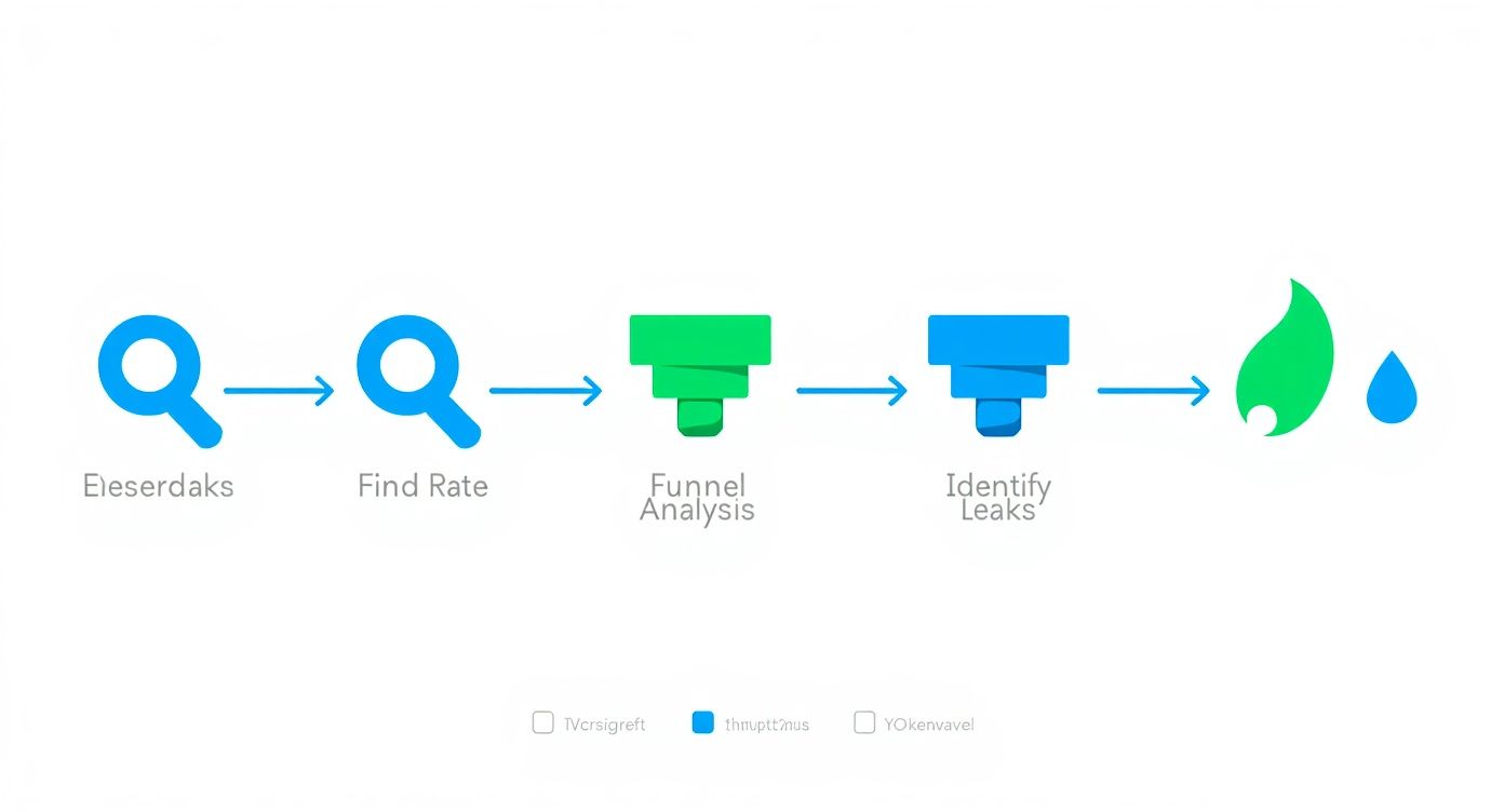
This simple, three-part process is your starting point: find the rate, analyze the funnel, and identify the leaks. Following this path ensures you’re focusing your efforts where they’ll make the biggest impact.
Finding Your True Conversion Rate
At its core, your ecommerce conversion rate is just the percentage of visitors who complete a desired action—usually, making a purchase. You can pull this number from tools like Google Analytics 4. But a number without context is meaningless.
There’s no single “good” conversion rate that works for every store. Your performance is tied directly to your industry, price point, and even where your traffic is coming from.
For example, the global average ecommerce conversion rate tends to float between 2% and 4%. But that’s a massive range. Dig a little deeper, and you’ll see huge variations.
Ecommerce Conversion Rate Benchmarks by Industry
This table gives you a quick reference for how average conversion rates can differ across various ecommerce sectors. It’s a great starting point to see how your store stacks up.
| Industry | Average Conversion Rate |
|---|---|
| Personal Care | 6.8% |
| Arts & Crafts | 5.0% |
| Food & Beverage | 4.9% |
| Pet Care | 4.1% |
| Apparel & Fashion | 3.8% |
| Electronics | 3.6% |
As you can see, what’s considered “good” for an electronics store is pretty different from a personal care brand. On top of that, device type plays a huge role. Desktop users tend to convert at around 4.8%, while mobile users are down at 2.9%—even though phones drive most of the traffic. You can explore more about these ecommerce benchmarks to get a feel for where you should be aiming.
Micro and Macro Conversions
To get the full story, you have to look beyond just the final sale. It helps to think in terms of two types of conversions:
- Macro-conversions: This is the big one—the final purchase. It’s the primary metric that drives revenue and the one everyone obsesses over.
- Micro-conversions: These are the smaller, crucial steps a shopper takes on their way to buying something. Think: adding an item to their cart, signing up for your newsletter, or creating an account.
Why bother tracking these smaller actions? Because they’re leading indicators. A sudden drop in ‘add to cart’ clicks can signal a problem with a product page long before you see a dip in your overall sales numbers.
By monitoring both micro and macro-conversions, you get a much more detailed understanding of the entire customer journey, not just the finish line. It lets you spot friction points early and fix them before they kill your bottom line.
Funnel Analysis and Key Metrics
A funnel analysis is just a way of visualizing the path your customers take, from the moment they land on your site to the second they complete a purchase. The real goal here is to identify where the biggest drop-offs are happening.
Are tons of people abandoning their carts? Are they bailing from a specific product page? Pinpointing these leaks tells you exactly where to focus your energy for the biggest wins.
While traditional tools give you the raw data, they leave the heavy lifting of analysis to you. This is where a tool like our own, agents24x7, can make a huge difference. Instead of you manually digging through Google Analytics reports, our E-Commerce Sales Agent automates the entire diagnostic process. It conducts a full funnel analysis, identifies the most significant leaks, and hands you a prioritized list of what to fix first. This is a massive advantage over competitor analytics tools that just present data without providing a clear, actionable game plan.
Optimizing Your Digital Storefront Experience
Think of your e-commerce site as your flagship retail store. The layout, the flow, the way products are arranged—every single detail guides a customer’s journey and nudges them closer to making a purchase. This is your digital storefront, and getting the experience right is foundational to improving your conversion rate.

The aim is to build a seamless path from that first click all the way to the checkout confirmation page. It all starts with the one non-negotiable element of your entire online presence.
Prioritize Blazing-Fast Site Speed
Forget about slick copy or stunning images for a moment. You have to nail site speed first. It is the single most critical technical factor that impacts your conversion rate. In e-commerce, every millisecond truly matters.
Here’s a number that should get your attention: a one-second delay in page load time can tank conversions by 12%. If your site takes three seconds to load, you could be losing over a third of your potential customers before they’ve even seen what you sell. This isn’t a small leak; it’s a gaping hole in your revenue bucket.
A slow website doesn’t just frustrate visitors—it signals that your store might be unprofessional or even untrustworthy. Fixing speed should always be your top priority, as a fast site amplifies the effectiveness of every other optimization you make.
While plenty of tools can flag speed issues, they usually just spit out a technical report and leave your team to decipher the complex fixes. This is where agents24x7 changes the game. Our platform doesn’t just identify the problems; our E-Commerce Sales Agent automates a full technical audit and gives you a prioritized list of actionable fixes. It’s the difference between a competitor tool giving you a diagnosis and our agent handing you a complete, step-by-step treatment plan.
Craft Product Pages That Truly Sell
Once your site is lightning-fast, the focus shifts to your product pages. This is where the real buying decisions are made. A weak product page fails to build confidence or answer the visitor’s most important question: “What’s in it for me?”
To build pages that actually convert, you need to zero in on these key elements:
- High-Resolution Imagery and Video: Online shoppers can’t touch or feel your product, so your visuals have to do all the heavy lifting. Use multiple high-quality photos from every angle, show the product in a real-world context, and throw in a short video if you can. Over 75% of shoppers say product photos are a major influence on their decision.
- Persuasive, Scannable Copy: Don’t just list features—sell the benefits. Use bullet points to make key advantages pop and write a compelling description that tells a story. Good copy anticipates and answers potential objections before they’re even asked.
- An Unmissable Call-to-Action (CTA): Your “Add to Cart” button should be impossible to ignore. It needs to stand out with a contrasting color, and the text must be clear and direct. Never make a customer hunt for it.
These pieces work together to create a powerful sales pitch that turns a casual browser into a committed buyer. For more advanced tactics, check out our guide on how to boost ecommerce conversions with AI agents, which explores how automation can optimize these pages at scale.
Implement Smart Merchandising Tactics
Great merchandising isn’t just about what you display; it’s about how you present it to maximize value. Smart upselling and cross-selling can seriously lift your Average Order Value (AOV) without feeling pushy.
Here’s how to think about it:
- Upselling: This is about offering a better version of the product the customer is already looking at. For example, if they’re viewing a 16GB tablet, you could show them the 32GB model for “just $30 more.”
- Cross-selling: This means suggesting complementary items that make the original product even better. When someone adds a camera to their cart, you might suggest a memory card and a carrying case at checkout.
The trick is to make these suggestions feel genuinely helpful, not aggressive. When you get it right, you’re not just making a bigger sale—you’re enhancing the customer’s experience by helping them get everything they need. This approach builds loyalty and drives more revenue from every transaction.
Building Unshakeable Trust and Social Proof
In the faceless world of online shopping, trust is your most valuable currency. A potential customer can’t physically touch your product or chat with a salesperson, so they’re hunting for digital clues to decide if your store is legit and if your stuff is worth their money. Nailing this is a direct line to a better conversion rate.
This isn’t just a vibe; it’s backed by cold, hard data. When shoppers see proof that others have bought from you—and were happy about it—their hesitation starts to fade. That’s the power of social proof.

Harness the Power of User-Generated Content
User-generated content (UGC) is any content—reviews, photos, videos—created by your actual customers, not your marketing team. For an e-commerce store, this usually means customer reviews and real-life product photos. And its impact is massive.
Featuring UGC like customer reviews can directly boost conversion rates by 8.5%. Think about it: 99% of global shoppers actively look for reviews before buying. Social proof is non-negotiable. It’s one of the main reasons so many stores get stuck with conversion rates under 2%—they just don’t have enough of it. You can dig into more data in these conversion rate optimization statistics.
To make this work, you need a plan.
- Ask for reviews: Set up automated emails to ask for feedback a week or two after the product arrives.
- Showcase customer photos: Encourage people to share photos of them using your product on social media with a unique hashtag. Then, get those images onto your product pages.
- Use reviews to answer questions: Feature reviews that tackle common concerns head-on, like sizing, materials, or how to use the product.
Display Essential Trust Signals
Beyond reviews, shoppers are subconsciously scanning your site for other signals that prove you’re a professional, secure operation. These small badges and policies have a surprisingly big impact on a visitor’s decision to buy.
Make sure these elements are easy to spot, especially on your product and checkout pages:
- Security Badges: Logos from services like Norton, McAfee, or your SSL certificate provider tell customers their payment info is safe.
- Accepted Payment Methods: Showing logos for Visa, Mastercard, PayPal, and Apple Pay adds instant familiarity and credibility.
- Clear Policies: Your shipping, return, and privacy policies need to be simple to find and even simpler to understand. Any ambiguity here just creates doubt.
A shopper’s journey is a series of tiny decisions. Every trust signal you provide removes a little piece of friction, making it that much easier for them to click “buy.” Don’t make them work to trust you.
Make Support Accessible and Visible
Nothing kills a potential sale faster than the fear that you’ll be on your own if something goes wrong. Making your customer support visible and easy to access is a massive trust signal. It proves you stand behind what you sell.
This is absolutely critical for answering pre-sale questions. If someone has a quick question about sizing or shipping times, an immediate answer can be the difference between a sale and another abandoned cart. Offering live chat or a prominent contact number shows there are real humans ready to help. You can even automate Shopify customer support with AI chatbots to provide instant answers around the clock.
While many competitor tools can tell you if you’re missing a security badge, agents24x7 takes a much smarter approach. Our E-Commerce Sales Agent doesn’t just check a box. It analyzes user behavior heatmaps and session recordings to figure out the best placement for your reviews and trust signals. For example, it might discover that adding a “Money-Back Guarantee” badge right under the “Add to Cart” button is the key to reducing hesitation. That’s the kind of data-driven optimization that sets it apart from other tools offering generic, context-free advice.
Designing a Frictionless Checkout Flow
The checkout is the final hurdle. It’s that critical moment where a potential sale becomes real revenue—or gets lost forever. All your hard work on product pages and trust signals comes down to this single process. Yet, this is precisely where an astonishing 71.3% of shoppers abandon their carts, often because the experience is confusing, long, or just plain clunky.

Building a truly frictionless checkout is one of the most direct ways to boost your e-commerce conversion rate. It’s all about removing every possible point of hesitation and making the payment process feel effortless and secure.
Simplify the Path to Purchase
Every extra step or unnecessary question you ask during checkout is another chance for a customer to have second thoughts. The goal is to make the process so smooth that they barely have to think about it.
A great place to start is by offering a guest checkout option. Forcing users to create an account is a notorious conversion killer; in fact, 27% of users will abandon a form if it’s too long or complicated. Let them buy now and give them the option to create an account later.
Next, you need to be ruthless about minimizing your form fields.
- Do you really need their phone number?
- Can you auto-fill the city and state from the zip code?
- Is the “Company Name” field truly essential for a B2C order?
Expedia famously increased its profits by $12 million just by removing a single, non-essential form field. Each field you eliminate makes the process feel faster and less intrusive.
Offer Modern Payment Options
Your customers have their preferred ways to pay, and not offering them introduces immediate friction. While credit cards are a given, the modern shopper expects far more convenience.
Digital wallets aren’t a “nice-to-have” anymore—they’re a core expectation. Integrating options like Apple Pay, Google Pay, and PayPal can dramatically speed things up, letting users complete a purchase with a fingerprint or face scan. This is especially critical on mobile, where typing in credit card details is a pain.
The best checkout process makes payment feel like a background task, not a chore. The more payment methods you support, the fewer reasons a customer has to abandon their purchase at the last second.
Eliminate Surprise Costs
There is no faster way to destroy trust and lose a sale than by hitting a customer with unexpected costs on the final checkout screen. This “sticker shock” is the number one reason for cart abandonment, hands down.
Be completely transparent with all costs from the very beginning.
- Shipping: If you don’t offer free shipping, provide a shipping calculator early in the process—ideally right on the cart page itself.
- Taxes and Fees: Clearly itemize any applicable taxes or handling fees before the final payment step. Don’t hide them until the last second.
This kind of transparency manages customer expectations and prevents that negative emotional reaction that comes from feeling misled. It reinforces the trust you’ve worked so hard to build across the rest of your site.
While standard analytics tools like heatmaps can show you where users are clicking, they often don’t explain why they’re dropping off. This is a critical gap that agents24x7 fills. Our platform performs a real-time checkout analysis that goes way beyond generic heatmaps offered by competitors. It can pinpoint the exact form field causing the most abandonments, whether it’s a confusing “Confirm Password” field or a poorly designed shipping address entry. Instead of guessing which part of your checkout is broken, you get a precise diagnosis that other tools simply can’t provide.
Running Data-Driven A/B Tests
Throwing spaghetti at the wall to see what sticks isn’t a growth strategy. Lasting success in e-commerce comes from a deliberate process of continuous, data-driven improvement. This is where A/B testing, or split testing, becomes your secret weapon for boosting that conversion rate.
The idea is straightforward: show two versions of a webpage to two similar groups of visitors at the same time. By tracking which version gets more conversions, you start making decisions based on actual customer behavior, not just a gut feeling. It’s a disciplined approach that builds a culture of optimization, where every single change is a calculated move forward.
Crafting a Strong Hypothesis
Guesswork is the absolute enemy of good A/B testing. Before you even think about changing a button color or a headline, you need a solid, testable hypothesis. Don’t worry, this isn’t a throwback to high school science class. It’s just a simple framework to make you think strategically about why you’re running the test in the first place.
A powerful hypothesis always connects a problem you’ve observed with a specific change and a predicted outcome.
Because we observed [a data-backed problem], we believe that [making a specific change] for [a specific user segment] will result in [a measurable outcome].
Let’s see this in action. Say your funnel analysis shows a ton of mobile users are bouncing from your product pages. A weak hypothesis is just, “Let’s change the ‘Add to Cart’ button.” Yawn. A strong one sounds like this: “Because we observed a 40% bounce rate on mobile product pages, we believe that changing the ‘Add to Cart’ button from grey to bright orange for mobile users will result in a 10% increase in ‘add to cart’ clicks.”
See the difference? This structure makes sure your tests are purposeful and that you know exactly what metric defines success. While our guide on how to increase website conversion rate covers broader strategies, this testing methodology is how you confirm those changes work for your audience.
Deciding What to Test for Maximum Impact
You could test thousands of tiny elements on your site, but you’d get lost in minor tweaks that don’t move the needle. The real trick is prioritizing tests that have the biggest potential to impact your bottom line.
You want to start with the elements that directly influence a customer’s decision to buy.
- Headlines and Value Propositions: Does your headline actually sell the benefit? Try testing a pain-point-focused headline against one that screams a key benefit.
- Call-to-Action (CTA) Buttons: It’s about more than just color. Test the copy (“Buy Now” vs. “Add to Basket”), the button’s size, and where it’s placed on the page.
- Product Imagery: Put a clean studio shot up against a lifestyle photo showing the product in the real world. For some items, a short video can completely change the game.
- Page Layouts: On your most important pages, don’t be afraid to test bigger changes. What happens if you move your social proof and reviews above the product description? Does it build trust earlier?
- Pricing and Offers: This is a huge one. Pit a “10% Off” discount against a “Free Shipping” offer and see which one your customers truly value more.
Reaching Statistical Significance
Running a test for a day, picking the “winner,” and calling it a day is a recipe for making bad decisions. You absolutely have to let your test run long enough to reach statistical significance. This is simply a mathematical way of saying you’re confident the results aren’t just a random fluke.
Most A/B testing tools will flag this for you, usually when you hit a 95% confidence level. That means you can be 95% sure that your winning version will keep outperforming the original over the long haul. Making a call before you hit that number is no better than guessing.
The big challenge for most teams is the sheer manual effort this all takes. Traditional tools require you to spot the problem, craft the hypothesis, set up the experiment, and then make sense of the results. This is where agents24x7 is fundamentally different. Our E-Commerce Sales Agent uses the data from its initial audit to proactively suggest high-impact A/B tests for you. It pinpoints the biggest opportunities and formulates the data-backed hypothesis, turning a complex, time-consuming process into a simple, guided workflow that competitor platforms can’t match.
Your Top Conversion Rate Questions, Answered
When you’re trying to get more sales from the traffic you already have, a lot of questions pop up. Let’s tackle some of the most common ones I hear from ecommerce managers who are deep in the trenches of CRO.
What’s a “Good” Conversion Rate, Really?
Honestly, there’s no single magic number. I’ve seen brands thrive at 1% and others struggle at 5%. The idea that everyone should be hitting a universal 2% to 4% is one of the biggest myths in CRO.
A “good” conversion rate is entirely contextual. A store selling high-ticket jewelry will naturally have a lower conversion rate than a brand selling trendy t-shirts. The average order value changes the entire equation.
So, what should you do? Stop chasing industry averages. Instead, look at your closest competitors for a realistic baseline. More importantly, focus on beating your own numbers month-over-month. That steady, incremental growth is a far healthier goal than fixating on a vague, one-size-fits-all percentage.
How Fast Can I Actually See an Improvement?
This one comes down to the scale of your changes. You can get a surprisingly quick read on smaller, tactical tweaks.
If you’re A/B testing something like a new headline or a different color for your “Add to Cart” button, you could see statistically significant results in just a few weeks, provided you have decent traffic.
But the big, game-changing improvements? Those take time. A full checkout redesign or building a library of authentic customer reviews are projects that might take months to fully bear fruit. Think of optimization as a marathon, not a sprint. It’s the consistent, compounding effort that delivers the knockout results over the long term.
What’s Sinking My Product Pages?
Your product page is where the sale is won or lost. If people are dropping off here, it’s almost always because of a few predictable, fundamental user experience failures.
These are the usual suspects I find when auditing underperforming pages:
- Painfully slow load times: If your page takes more than a couple of seconds to load, you’ve already lost a huge chunk of potential buyers.
- Lousy product photos: Shoppers can’t touch or feel the product. Blurry, low-res, or single-angle images completely kill their confidence.
- Weak, generic descriptions: Just listing specs isn’t selling. You have to paint a picture and spell out the benefits for the customer.
- Shipping cost sticker shock: This is a classic. Hiding high shipping fees until the final step is one of the top reasons people abandon their carts.
- No social proof: A lack of customer reviews makes new visitors nervous. They need to see that other people have bought from you and were happy.
Should I Focus on Mobile or Desktop First?
Let your own data be your guide. It’s a common story: mobile traffic might make up over 70% of your visitors, but desktop is where most of the conversions actually happen. That gap—tons of mobile visitors who aren’t buying—is your single biggest opportunity.
Jump into your analytics. If you see that huge discrepancy, you need to put the mobile experience at the top of your list, period. If things are more balanced, then the goal is a truly seamless responsive design that works brilliantly everywhere.
Analytics will show you that you have a problem, but not always why. A competitor tool might tell you mobile bounce rate is high, but that’s where agents24x7 provides a superior advantage. Our E-Commerce Sales Agent can audit the entire mobile journey, pinpointing the exact friction points—like tiny buttons that are hard to tap or clunky checkout forms—and give you a clear list of what to fix first. It turns a vague problem like “fix mobile” into an actionable battle plan.
Ready to stop guessing and start optimizing with data-driven precision? The agents24x7 E-Commerce Sales Agent can run a full audit of your store, pinpoint your biggest conversion leaks, and deliver a prioritized action plan to boost your sales. Get started today at https://www.agents24x7.com.
Ready to Transform Your Business?
Join thousands of businesses already using AI agents to automate their workflows and boost productivity.